
The accordion / tab widget helps organize content into either expandable accordions or in boxed tabs layout.
Accordions Example
An accordion is a design element that expands in place to expose some hidden information. Accordions push the page content down when expanded. The accordion uses the Rich Text Editor, therefore the text can be styled and linked, images can be placed, along with embedded videos.
The widget defaults to accordion, so you only need to set your styles.
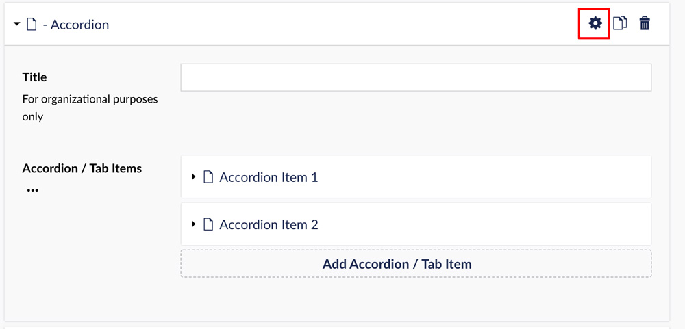
Choose the Gear icon to adjust the settings for the widget.
There are several options to decorate the accordions by choosing label font size, background color and text color.
This is my text. I can bold, italics, and format with header tags and anything else available with the Rich Text Editor.
Accordions can be additionally styled using the gear "settings" icon on the right of the content box.
 In this example, I've added a photo to the accordion.
This is the second accordion in this grouping.
Tabs Example
A tab is a design element where content is separated into different panes, and each pane is viewable one at a time.
There are several options to decorate the tabs by choosing label font size, background color and text color, then also the inactive background and text color.
To use, select the Accordion / Tab content type. The widget defaults to accordion, so you will need to turn on the toggle switch in settings to activate the Tab view, then set your styles.
This is the text area for Tab 1. Since it's a text editor, you may add styling to your text, embed videos and add photos.
In this example, I've added a photo to the tab.
This is the text area for Tab 2.