
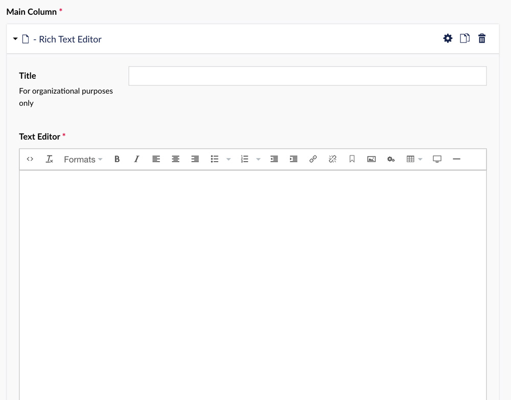
A Rich Text Editor RTE (often called a WYSIWIG editor - what you see is what you get) is the most used widget in our collection. It's the basic tool used to place your content on the webpage. Much like Microsoft Word, you can use the toolbar of editing and formatting icons to style, insert links, images and embed video.

Note: Pasting text into the RTE should preserve most formatting, but some types of formatting may not perform the way you intended. You might need to clear formatting (another icon in the toolbar) after pasting and manually add your formatting in the RTE.
Formats
 Formats are options that allow you to change the look of your content. There are several options to help the page look and feel how you want it to. Below is an explanation of each option in the Formats dropdown and how they can be used within your content.
About Headings
Headings are a vital part of the content structure. A heading is a title, or introduction, to a group of content.
How to Create a Heading
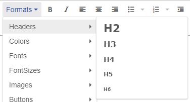 In order to turn your text into a heading, highlight the text in which you want to become a header. Then under the Formats dropdown menu, hover over "Headers" and select the appropriate header type.
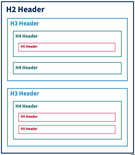
Headings are hierarchal. The top level is H2; any sub-headers for the H2 will be H3, and sub-headers of H3 will be H4, and so on. For example, "About Headers" is an H2 header and "How to Create a Header" is an H3 heading.
Removing Headers
To remove the header formatting, highlight the text which you originally made a header that you would now like to convert back to normal text. There are then two ways to remove the header formatting:
- Click the clear formatting button. (This option will remove all formatting associated with the highlighted text)
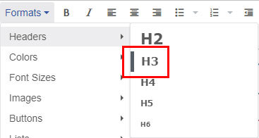 Navigate to the header under the Formats dropdown menu. You should see a dark bar to the left of the selected header indicating that the header is currently in use for the highlighted text. Clicking on the selected header will remove it from the highlighted text. (This option only removes the header from the highlighted text)
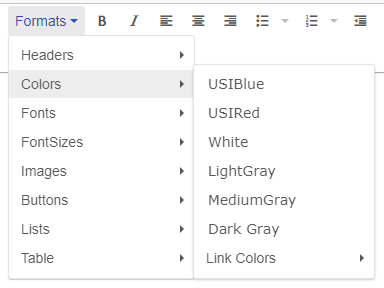
About Colors
The "Colors" option in the Formats dropdown will allow you to change text color from the default color to any color available in the approved list.
Once a color has been added, the color will not change visually inside of the text editor. To make sure color was added to the correct text we recommend clicking the "Save and preview" button in the bottom right of the page editor screen.
 Changing the Color of Your Text
To change the color of text, first, highlight the text you would like to add the color to. Next, under the Formats dropdown menu hover over "Colors" then select the desired color.
Changing the Color of Your List Item
To change the color of the text within a list, first, select the list by clicking on a list item (the text within a bullet point) with the cursor. You may also highlight the entire list but it is not required. Next, under the Formats dropdown menu hover over "Lists", then hover over "Colors" and select the desired color. This will change the color of the text for all text within the list and not just a single item or selection of text.
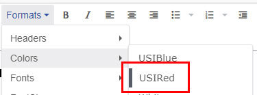
Changing the Color of Your Links
To add color to links, first, select the link by clicking on the link text with the cursor. You may also highlight the entire link but it is not required. Once the link is selected, under the Formats dropdown menu hover over "Colors", then hover over "Link Colors" and select the desired color.
Removing Color from Your Text
To remove color from text, highlight the text which you originally added to color to that you would now like to remove. There are then two ways to remove the color formatting:
- Click the clear formatting button. (This option will remove all formatting associated with the highlighted text)
 Navigate to the color under the Formats dropdown menu. You should see a dark bar to the left of the selected color indicating that the color is currently in use for the highlighted text. Clicking on the selected color will remove it from the highlighted text. (This option only removes the color from the highlighted text)
Available Colors
- USI Blue
- USI Red
- White*
- Light Gray*
- Medium Gray
- Dark Gray
*Background colors are not automatically applied, this has been done to make the text more legible. Please avoid putting light text on a light background and dark text on a dark background, this could lead to low contrast not in compliance with ADA standards.
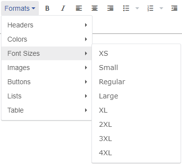
About Font Sizes
Font Sizes allow you to change the size of your text. By default, paragraph and list style text is set to "Regular".
Once a font size has been selected, the size will not change visually inside of the text editor. To make sure the font size was changed on the correct text we recommend clicking the "Save and preview" button in the bottom right of the page editor screen.
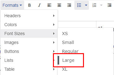
 Changing the Font Size
To change font size, first, highlight the text in which you would like to change the size of. Next, under the Formats dropdown menu hover over "Font Sizes" then select the desired size.
Removing Font Size
To remove font size from text, highlight the text which you originally changed the size of that you would now like to change back to default. There are then two ways to remove the font size formatting:
- Click the clear formatting button. (This option will remove all formatting associated with the highlighted text)
 Navigate to the font size under the Formats dropdown menu. You should see a dark bar to the left of the selected size indicating that the size is currently in use for the highlighted text. Clicking on the selected size will remove it from the highlighted text. (This option only removes the font size from the highlighted text)
Available Font Sizes
- XS
- Small
- Regular
- Large
- XL
- 2XL
- 3XL
- 4XL
About Images
The "Images" formatting options allow you to wrap text around an image. This should be used in place of default align options on the rich text editor bar.
Once a text wrap option has been selected, the text and image will not wrap visually inside of the text editor. To make sure the text wrap was added correctly we recommend clicking the "Save and preview" button in the bottom right of the page editor screen.
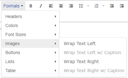 Adding Text Wrap to Images
In order to add text wrap to an Image, first, select the image. Next, under the Formats dropdown menu hover over "Images" then select the desired text wrap option. If you have added an image with a caption you must select the option that includes "w/ Caption", it is not recommended to use the options without "w/ Caption" when a caption is present.
Removing Text Wrap
To remove the text wrap option, select the image which you originally added the text wrap to that you would now like to change back to default. There are then two ways to remove the image formatting:
- Click the clear formatting button. (This option will remove all formatting associated with the image)
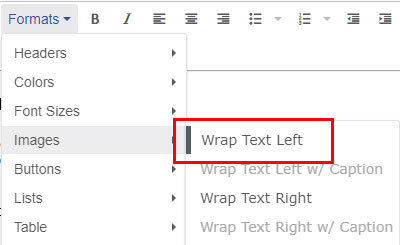 Navigate to the text wrap option under the Formats dropdown menu. You should see a dark bar to the left of the selected option indicating that the option is currently in use for the image. Clicking on the selected option will remove it from the image. (This option only removes the text wrap from the image)
About Buttons
The "Buttons" formatting option allows you to easily change a link from a simple line of text into a button.
Once a button style has been selected, the link will not change visually inside of the text editor. To make sure the button style was added correctly we recommend clicking the "Save and preview" button in the bottom right of the page editor screen.
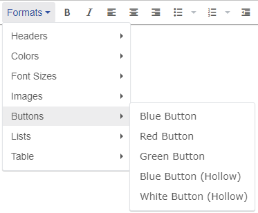 Adding Button Styles to Links
In order to add a button style to a link, first, select the link by clicking on the link text with the cursor. You may also highlight the entire link but it is not required. Next, under the Formats dropdown menu hover over "Buttons" then select the desired button style option.
Removing Button Styles
To remove the button style, select the link which you originally added the button style to that you would now like to change back to default. There are then two ways to remove the button style formatting:
- Click the clear formatting button. (This option will remove all formatting associated with the link)
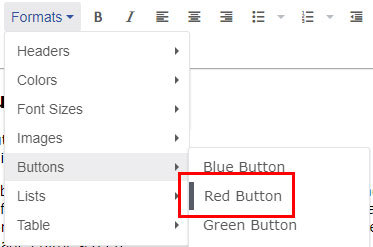 Navigate to the button style option under the Formats dropdown menu. You should see a dark bar to the left of the selected option indicating that the option is currently in use for the link. Clicking on the selected option will remove it from the link. (This option only removes the button style from the link)
Available Button Styles
*Background colors are not automatically applied, this has been done to make the button more legible. Please avoid putting light button styles on a light background and dark button styles on a dark background, this could lead to low contrast not in compliance with ADA standards.
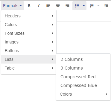
About Lists
The "Lists" formatting has several options that allow for different styling and column amounts.
Once a list style has been selected, the list will not change visually inside of the text editor. To make sure the list style was added correctly we recommend clicking the "Save and preview" button in the bottom right of the page editor screen.
 Adding Styles to Lists
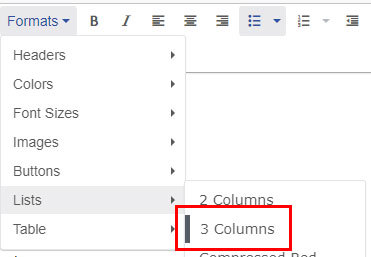
In order to add a list style to a list, first, select the list by clicking on a list item (the text within a bullet point) with the cursor. You may also highlight the entire list but it is not required. Next, under the Formats dropdown menu hover over "Lists" then select the desired list option.
Changing the Color of Your List Item
To change the color of the text within a list, first, select the list by clicking on a list item (the text within a bullet point) with the cursor. You may also highlight the entire list but it is not required. Next, under the Formats dropdown menu hover over "Lists", then hover over "Colors" and select the desired color. This will change the color of the text for all text within the list and not just a single item or selection of text.
Removing List Styles
To remove the list style, select the list which you originally added the style to that you would now like to change back to default. There are then two ways to remove the list style formatting:
- Click the clear formatting button. (This option will remove all formatting associated with the list)
 Navigate to the list style option under the Formats dropdown menu. You should see a dark bar to the left of the selected option indicating that the option is currently in use for the list. Clicking on the selected option will remove it from the list. (This option only removes the list style from the list)
Available List Styles
- 2 Column
- 2 Column
- 2 Column
- 2 Column
- 2 Column
- 2 Column
- 2 Column
- 2 Column
- 3 Column
- 3 Column
- 3 Column
- 3 Column
- 3 Column
- 3 Column
- 3 Column
- 3 Column
- 3 Column
- 3 Column
- 3 Column
- 3 Column
- 3 Column
- Compressed Red Item 1
- Item 2
- Compressed Red
- Compressed Red Item 4
- Compressed Red
- Compressed Blue Item 1
- Item 2
- Compressed Blue
- Compressed Blue Item 4
- Compressed Blue
USI Email
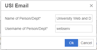 The USI Email option allows you to add a contact form within the body content. To add a contact form, first, highlight the text in which you would like to use as a button to the contact form modal. Next, fill out the fields for the Name and Username of the Person or Department that the form will be submitted to. The Name will be displayed as the contact to the user filling out the contact form. The Username is used to determine who receives the submitted contact form. The Username is the first part of the person or departments email. Do not use the first part of vanity emails (for example archie.eagle).
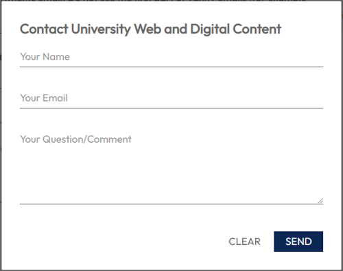
Because the contact form button acts as a link to the contact form, you can use button styles on it if needed.