
![]() Accessible PowerPoint presentations allow every user to navigate and understand your content, whether they rely on a screen reader, use keyboard navigation, or view slides in different modes.
Accessible PowerPoint presentations allow every user to navigate and understand your content, whether they rely on a screen reader, use keyboard navigation, or view slides in different modes.
Use PowerPoint's pre-built layouts (Home → Layout) instead of manually arranging text boxes. Built-in layouts are already structured for assistive technologies, like screen readers, that read content in the correct order and placeholders are tagged semantically. Avoid blank slides with free-floating text boxes, as these disrupt reading order.
Go to Home → Arrange → Selection Pane to see and reorder all objects on a slide. Screen readers read objects from bottom to top in this panel, so arrange accordingly. Rename objects with descriptive labels (e.g., "Chart: Q3 Revenue" rather than "Rectangle 3").
Every slide must have a title in the title placeholder. not just styled text. Slide titles act as landmarks for screen reader users navigating the presentation. Avoid vague titles like "Slide 1" or duplicate titles across slides.
Limit each slide to one main idea. Avoid busy backgrounds, low-contrast watermarks, and decorative animations that can distract or cause difficulties for users with cognitive disabilities or vestibular disorders. If using animations, avoid auto-playing rapid motion.
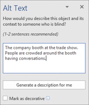 Add Meaningful Alternative "Alt" Text to All Images, Charts and Graphs
Right-click any image or chart → View Alt Text. Write a concise, meaningful description of what the visual conveys, not just what it looks like, but why it's there. For purely decorative images, mark them as "decorative" so screen readers skip them. See the section below for additional tips for color use in charts and graphs.
Using sans-serif fonts like Calibri, Arial, or Aptos, is easier to read for people with dyslexia or low vision. Keep body text at 24pt or larger; avoid anything below 18pt. Use bold sparingly for emphasis rather than italic, which can be harder to read. Avoid using all caps.
Use colors with strong contrast between text and background, and avoid relying on color alone to convey information. With around 13 million Americans affected by color blindness, color distinctions can be meaningless or confusing for a significant portion of your audience. Avoid things like "Items in red are urgent". Pair color with text labels, patterns, or icons. In charts, add data labels or use patterns in addition to color fills. This helps colorblind users and anyone printing in grayscale.
Instead of "click here" or pasting raw URLs, use descriptive link text like "Download the 2026 Annual Report." Right-click the link → Edit Hyperlink → change the display text. Screen readers announce link text, so it should make sense out of context.
Only use tables for tabular data, not for layout. In Table Design, check "Header Row" so the first row is marked as a header. Keep tables simple. Avoid merged cells and nested tables which confuse screen readers. Add alt text to the whole table describing its purpose.
Insert captions for any embedded video by using PowerPoint's built-in auto-captioning (Insert → Video → check "Insert Captions") and review for accuracy. For audio clips, provide a written transcript. This helps Deaf and hard-of-hearing users as well as people in sound-sensitive environments.
Use the Notes pane below each slide to provide additional context, full descriptions of complex visuals, or speaking notes. These are accessible to screen readers and useful for people who receive the file without a presenter.
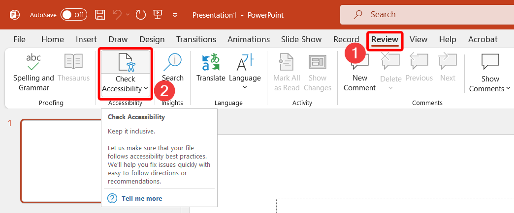 Review → Check Accessibility runs a real-time scan that flags missing alt text, reading order issues, low contrast, missing slide titles, and more. Work through the Errors and Warnings list before distributing. PowerPoint also shows accessibility issues live as you build in newer versions (Microsoft 365).
When saving as PDF, go to File → Save As → PDF → Options and check "Document structure tags for accessibility." This carries over heading structure, alt text, and reading order. If sharing the .pptx file directly, it retains all accessibility features natively.