
![]() An accessible Word document ensures that anyone can engage with the content you create, including people who rely on assistive technologies or who have hearing, motor, or cognitive disabilities. Structuring your content correctly is key, as it allows screen readers and other assistive tools to interpret your document accurately. This page walks you through the steps to help you build accessible Word documents from the ground up.
An accessible Word document ensures that anyone can engage with the content you create, including people who rely on assistive technologies or who have hearing, motor, or cognitive disabilities. Structuring your content correctly is key, as it allows screen readers and other assistive tools to interpret your document accurately. This page walks you through the steps to help you build accessible Word documents from the ground up.
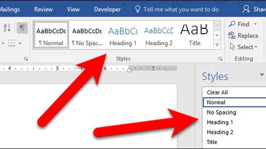 Word's built-in heading styles, such as Heading 1, Heading 2, and Heading 3, do more than visually organize your document; they create a structure that screen readers use to help users navigate content efficiently.
Apply headings using the Styles panel in the Home tab, working through the levels in order without skipping any, and avoid manually bolding or resizing text as a substitute. This logical hierarchy ensures assistive technologies can accurately interpret and present your document to all readers.
Use colors with strong contrast between text and background, and avoid relying on color alone to convey information. With around 13 million Americans affected by color blindness, color distinctions can be meaningless or confusing for a significant portion of your audience. Pair this with clean, legible fonts to further improve readability for all users. Avoid justified text and ensure that font size is sufficient, usually a minimum of 11 points.
Alternative text, or "alt text," is a short written description attached to an image, graph or chart that allows screen readers to convey its content to users who are visually impaired. Without it, those users may encounter nothing more than "image" when navigating your document, leaving them without the context everyone else receives.
To add alt text in Word, right-click the image or chart, select "Edit Alt Text," and enter a clear, concise description of what the visual shows and why it matters in context. If an image is purely decorative, mark it as such to be ignored by screen readers.
For graphs and charts, consider a descriptive caption that outlines what the data is showing.
When using tables in Word, keep them simple and avoid merging or splitting cells, as this can disrupt the way screen readers navigate the content. Use tables for data only, not for layout purposes, and ensure every table has a clearly defined header row to give context to the information in each column.
To set a header row in Word, select the top row of your table, right-click, go to Table Properties, and check "Repeat as header row at the top of each page." Keeping your table structure straightforward makes it far easier for assistive technologies to read and present the information in a logical order.
Descriptive link text means using words that clearly explain where a link leads or what it does, rather than generic phrases like "click here" or "read more." Screen readers often compile a list of all links in a document for users to navigate, so vague link text becomes meaningless without the surrounding context. For example, instead of writing "click here for more information," you might write "visit the Web Accessibility Guidelines page."
To add or edit link text in Word, right-click the link, select "Edit Hyperlink," and update the display text in the field provided. Clear, descriptive links improve the experience for all readers, not just those using assistive technologies.
When using columns in Word, always create them using the built-in Columns feature found under the Layout tab, rather than using tabs or spaces to simulate the appearance of columns. This ensures that screen readers follow the correct reading order rather than jumping across the page in a confusing sequence.
For lists, use Word's built-in bulleted or numbered list styles rather than manually typing dashes or numbers, as this signals to assistive technologies that the items are related and should be read as a group. Avoid creating overly complex or deeply nested lists where possible, as these can be difficult to follow for all readers. Consistent use of these built-in tools keeps your document structured, predictable, and easy to navigate.
 Accessibility Checker
Word's built-in Accessibility Checker is a helpful tool that scans your document and flags potential accessibility issues, offering suggestions on how to fix them.
To open it, go to the Review tab and select "Check Accessibility," or find it under File, then Info, where it will display any issues detected.
The checker organizes its findings into three categories:
While the Accessibility Checker is a great starting point, it is worth noting that it does not catch every issue, so reviewing your document manually alongside the checker gives you the most thorough result.
When converting a Word document to PDF, the method you use matters greatly for preserving accessibility. Avoid using "Print to PDF" as this strips out the document's underlying structure, removing headings, alt text, and other accessibility features in the process.
Instead, go to File, select Save As, and choose PDF from the file format options. Before saving, click "More Options" and then "Options" in the dialog box, and make sure "Document structure tags for accessibility" is checked, as this carries over the accessible structure you built in Word into the final PDF.
Taking these steps ensures that the work you put into making your Word document accessible is not lost in the conversion process.